What is graphic pressure in handwriting?
Hello everyone! In graphology, pressure refers to the force behind a stroke. When we talk about “graphic pressure”, we mean the force with which we press the pen on the paper. Some people barely touch the pen when they write, while others apply significant pressure. Some people achieve clean strokes, while others tend to have messy, thick writing. It is essential to work with original samples, although good quality photocopies can give a rough idea of the pressure used when writing. It is also important to consider the materials used, such as the pen tip, ink, and paper quality. Factors such as writing surface, writing position and environmental conditions also influence graphic pressure. In cases where irregularities are found in the writing pressure, it is recommended to obtain several samples to investigate whether they are due to the tools used.
There is an “easy” way to feel the pressure a pen applies to paper as you write. Simply run your hand on the backside of the sheet. What do you feel?
What does the pressure of the strokes reveal?
From the Psychological point of view, the pressure in the stroke reflects the mental energy of a person. Confidence and conviction in what we do are manifested in writing through pressure. When writing, sometimes we are not aware of how much force we use. The muscles of the hand move on their own, beyond our control or will. Both too little and too much pressure can indicate disorders or health problems. Proper writing pressure indicates health, vitality and strength.
What is healthy handwriting pressure?
PRESSURE GRAPHIC MODULE
Pressure should not show too many sudden fluctuations. It should be firm and clear, without twisting, shaking, shaking, breaking or congestion.
Max Pulver believes that stroke strength or pressure when writing is an indicator of a person’s creative productivity, although he makes no assumptions about the specific quality of the work produced.
The sub-aspects that we will analyze in this article are: Tension, caliber, depth and relief.
Tension in Graphology
Firm handwriting pressure
In a tense and firm writing, there are clear and straight movements. It is associated with straight lines, well-defined and clean strokes. There are no undulations or inflections in any direction. Overall, the writing is dynamic and decisive. Interpretation: These individuals are characterized by reason, logical thinking, concentration, and introversion. They exhibit security, stability, a tendency to control everything, and a dominant personality. Signs of introversion indicate good resistance to change. While they don’t seek dominance, they display firmness and won’t allow themselves to be dominated. Higher tension correlates with increased resistance and physical dynamism. Negatively, accumulated emotional tensions can lead to sudden, violent, or disproportionate reactions, such as intense anger, aggression, or abrupt behavior.
Loose pressure
Tension is loose when movements are twisted, undulating, or curved. Strokes may have angles but lack tension. Interpretation: It is seen as a lack of firmness in personality, an inability to act, a weak inclination to act, a deficit in vital tone, and poor resistance to change. It is also associated with greater imagination and childish characteristics in personality. Individuals with these traits tend to be unstable, insecure, and dependent, although they can sometimes be communicative and extroverted. It is linked to the lymphatic temperament. Note: In Gille’s “Psychology of Writing,” Neurasthenia is mentioned. This term was used in the 19th and early 20th centuries to describe a disorder characterized by excessive fatigue, exhaustion, irritability, and difficulty concentrating. Nowadays, these symptoms could be associated with disorders like chronic fatigue syndrome or anxiety disorders.
Soft pressure
In this writing, predominant movements are curved with little pressure. It is often associated with descending lines. Loops curve, forming a “C” shape. Interpretation: It adapts without resistance, displaying sociability, patience, sweetness, loyalty, and passivity. Small angles may appear at the base or top of letters, or above “t.” According to Crepieux-Jamín, these angles are justified because “soft people are stubborn. The weakness of their energy leads them to say NO to everything proposed. The lower the intellectual level, the greater the obstinacy.”
Alternately Tense and Loose handwriting
It is firm in some areas and loose in others, for example, tense loops and a loose middle, or vice versa. Changes in tension can also be observed in different graphic zones, taking into account the symbolism of space.
Depth pressure in Graphology
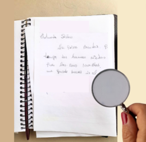
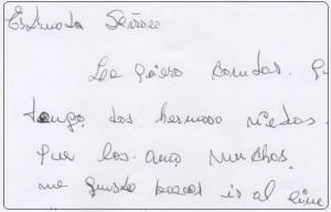
Deep pressure handwriting: Depth is perceived by touch on the back of the sheet, leaving a groove or can be visualized using a magnifying glass. Breaks in the paper may appear. Interpretation: Deep and strong pressure expresses the amount of energy the individual possesses. Increased pressure leads to a decrease in graphic speed, translating to slower mental processes, work endurance, and concentration capacity. In general, it signifies a good intellectual level, logical thinking, good health, decisiveness, and resolution. Perseverance, impulsiveness, introversion, independence, yet appropriate social interaction. According to Pulver: Good creative activity, regardless of the quality of the production.
Superficial pressure handwriting: This occurs when the stroke does not penetrate the paper, and there is no groove felt on the back of the sheet. The intensity of color varies within the same stroke. Interpretation: This type of writing symbolizes a person with more superficial and magical thinking, indecisive and insecure, not authentic in their expressions. Distrustful, even if extroverted, they are dependent and have a need to be accepted by others.
Relief in Graphology
The relief for graphology is the contrast between the background and the written text. It is personal and independent of intention. With the same paper and ink, if we ask several people to write a text, we will observe variations in the relief.
High Relief: Powerful contrast between ink and paper. It gains more value when combined with clear, orderly and simplified writing. Interpretation: Expresses vitality, psychological balance and work capacity. Extraversion, independence, desire to stand out and tendency to impose one’s own opinion.
Low Relief: Faded and pale writing, lack of contrast between ink and paper. Interpretation: It means slow thinking, absorbing and selfish personality, narcissism, influenceability and dependence.
Caliber pressure in Graphology
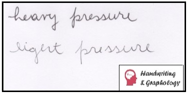
In graphology, the thickness or width of the line is called caliber.
Nurtured Writing: When the writing has a caliber greater than half a millimeter it is called nourished. Indicates good psychophysical health and good performance and productivity.
Robust writing: When it contains deep, firm, fast and supported writing characteristics, and the caliber exceeds 3/4 of a millimeter, it is called robust. Indicates greater mental than physical strength.
Graphic pressure abnormalities
Crooked strokes, breaks, shaky lines and pasty writing. These types of writing anomalies are addressed in Graphopathology. It is important to note that the graphologist does not diagnose but rather collaborates and advises in disciplinary teams to prevent diseases.
Sources: Vels. A, Writing and Personality; Vels, A, Dictionary of Graphology.