Handwriting Analysis Letter M and Interpersonal Relationships
Graphology is a graphical projective technique that studies the handwritten structure with the objective of getting to the most intimate side of the human being. Among the different graphological schools we find:
Gestalt Graphology, represented by German philosopher Ludwig Klages (1872 – 1956), who used the psychological theory of Gestalt to Graphology, considering the human personality as a whole, contributing to graphological analysis with a holistic approach of graphical space. This graphological school values the sample of handwriting as an integrated whole, like when we look at a picture. When looking at a picture, we see “the whole” image and we do not pay attention to detail or elements in particular.
Inductive Graphology or study of reflexctive letters that analyzes the text from “particular to general“.
What are Reflex Letters?
The reflex letters are the ones that, due to their structure and location in the graphical space, recall psychological signs and symbols indicating physical states or behaviors. It is based on French Graphology of Abat Michón, which is descriptive; it observes the writing from the specific of each trait, in order to assemble all the elements and discovering the personality of the writer.
The study of reflex letters in graphological analysis constitutes a complementary contribution to the main analysis, represented by the eight graphical aspects and the signature. The graphical aspects are: layout, dimension, shape, speed, inclination, direction, continuity and pressure.
The main letters are: d, M, t, g, i, r, and are related to specific traits of personality. The characteristic or singular way with which the writer executes them, turns them into highlighted elements that accent their psychological value at the moment of interpreting a piece of writing. Today we refer to letter M, capital and lowercase.
Read also: Signature Analysis and Personality. Tips for a Positive Signature
Handwriting Analysis Letter M: Parts
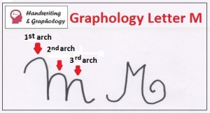
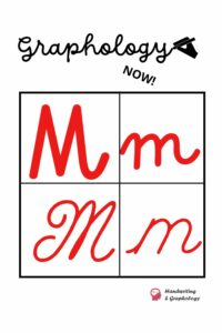
Handwriting Analysis: Letter M. Describe the PARTS of letter
Letter “m” is constituted, according to traditional calligraphy, by three arches and each one of them is given a symbolism.
From the psychological point of view, capital letters generally symbolize the Ego of the writer, what he feels about himself, his level of aspirations, his self-esteem and lowercase letters that accompany capital letters, correspond to the feeling coming from “others”.
In the case of letter “m” in Graphology, it reflects the interpersonal relationships, the equilibrium between the Ego, the family and the social life of the individual.
Read also: Handwriting Analysis Capital letters
Symbolism of the three Arches of Letter “m”
The three arches of letter M are studied according to the symbolism of space of Max Pulver. This investigator born in Berne, 1889, established the concordance between the way of executing the graphisms in the sheet of paper and the expression of the conduct of the individual in society. This way, he managed to express the symbols in writing. Pulver points out that we have incorporated mental associations from ancestral times that we use daily and that guide us subconsciously.
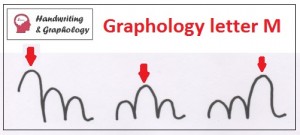
- The first arch of letter M capital represents the value the individual grants to himself and to his deep Ego.
- The second arch symbolizes the space the individual perceives he occupies within his family environment or within “those close others”.
- The third arch expresses subconsciously the importance the individual grants himself within the social, professional environment in which he gets around.
This letter M allows us to appreciate harmony or disharmony between the deep Ego, the family and “the others”. When letter M is formed only by two arches, the interpretation is simplified. The first arch symbolizes the Ego of the writer, the second arch symbolizes all the rest (the others, the family environment and the social environment) and the attributed symbols are used only for the first and third arch.
According to the characteristics of each one of the arches of letter M, we shall obtain an idea of the concept the individual has of himself (his feelings towards the Ego), of his self-esteem in relationship to others, his environment and family. It reflects the presence of superiority feelings (he sees himself as a more influential individual than others) or inferiority, subordination or submission feelings.

- When the three arches are equal: This indicates that there is a certain degree of equilibrium in self-esteem in the three spheres of personality.
- If they are over-elevated: Pride, distance, arrogance, despise. If accompanied by small lowercase letters it is interpreted as an impulse to compensate an inferiority feeling with unmeasured pride, ambition of hierarchy or power. The arch that is elevated over the others symbolizes the level in which the individual overvalues himself.
- When the three arches are low: We infer it is a modest personality or lacking confidence. The arch that presents unevenness respect from the others reflects the sphere in which the writer perceives himself as inferior or less important. If any of the arches is suspended (this means the descending stroke does not reach the base line in the middle zone) it expresses depreciation.
Handwriting Analysis Capital M
First lower arch: It expresses a low level of self-esteem. Let us see the meaning of low capital letters: capital letters are considered low when their height does not reach the proportion of 3 to 4 times larger than the height of the middle zone of the letter. If the graphical environment is positive, with a normal width and harmonic writing, this reflects a simple, modest, pleasant attitude. The individual dos not seek to control others´ lives. On the other hand, if letters are narrow and compressed, this expresses shyness, inferiority complex, need for approval and support, lack of self-confidence.
First arch is larger or highlighted: (Whether it has two or three arches it is the same interpretation). It indicates he considers himself more important than others. This approach is normal. There is some pride and a certain need of feeling recognized and valued by the environment, but within the bonds of normality.
Second arch is larger: Grants more importance to family. Might belong to a “clan” kind of family and is proud of belonging to it.
Third arch is larger: Ambitious person, opportunist, feels desire of standing out in society and criticism are of great importance. Need for standing out. Egocentric tendencies.
Graphology Letter m. Shape
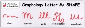
Graphology: SHAPE. Handwriting Analysis: letter M
- Wide: See extended writing. Psychologically, it means aplomb, composure, extroversion, need for contact with the others, generosity, sociability, self-confidence.
- Narrow: It is related to withdrawn, reflexive, insecure, shy individuals. Lack of self-confidence.
- Curls: Similar to 2 or 3 “l letters”. It means tendency for expansion, adaptation, ability for contact and for expression. Since the arches turn towards the writer, it indicates a tendency to self-compliment.
- Complicated: Inflated, with exaggerations: vanity, need for pretending what it is not.
- In garland: Similar movement to letter “u”. Open and upwards. Simplifies writing and evolves respect to the learned calligraphy. It means naturalness to relate to others, sociability, ability for adaptation. It is a sign of evolution, kindness and grace.
Graphology Letter m: Initial and Final Traits

- Wrapping initial trait under the first arch: All curved movements in spiral denote a narcissist characteristic. Self-confidence.
- Very developed initial trait: Recalls the past, conservative spirit, lover of tradition and family.
- Crossing out initial trait: Anything that crosses the capital letter out, since it symbolizes the Ego, expresses great discontent, despise, guilt feelings.
- Vertical descending final trait: The trait that goes down to the instinctive zone. Practical realism, temperamental discharges, jealousy, lack of self-control. Matilde Ras associates it with greed, economical needs.
The interests of the individual are centered in turn to tangible objects. Enjoys money and material possessions. Values the prestige and superiority that his belongings grant him. Feels superior than friends and family, but differ in society towards the public. This is typical of certain politicians who have little consideration for their family, but who accept to integrate due to public opinion. If this trait finishes in a curl: Hoarding with greed.
Handriting Analysis: How to analyze Letter “m” Lowercase
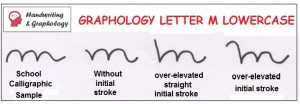
- School Calligraphic Sample: Submissive and passive personality. Confines himself in order to hide the excess of sensitivity.
- Without initial stroke: Shyness, fatigue, inhibition.
- Over-elevated straight initial stroke: Vanity. Selfish spirit.
- Over-elevated initial stroke: Excess of self-esteem, arrogant, conceited, proud. With a positive graphical environment: ability for self-reflection.
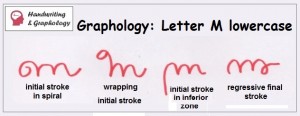
- Initial stroke in spiral: Hoarding tendencies, possessive, selfish, egocentrism.
- Initial stroke in angle: Clear objectives, defined, decision, energy, ethical principles, severe Superego.
- Wrapping initial stroke: Obstinacy, stubbornness, negativity, capricious character, untreatable.
- Initial stroke in inferior zone: Narcissism, vanity, pride, need for pleasing himself.
- Regressive final stroke: Hoarding tendency, selfish, possessive, material interest, falseness.
Lowercase- shaped Letter “m”
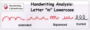
- Extended: Expansion.
- Squeezed: Irritable, oppression of state of mind, desire for anonymity.
- Curved-garland: Enchanting person, receptive, easily adapts to codes that society imposes, flexible, generous, possesses diplomacy, sensuality.
- Stretched garland: Weakness in character, tendency to adjust without conditions.
- Sharp endings: Characteristics of nervous temper. Impatience, irritability.
- Curved at the top-angled at the bottom: defensive firmness, firm character, confined, rigorous, acute observer, ability for concentration.
- Curved at the bottom-angled at the top: Firmness and will unite with sweetness and expansion in the realization of projects. Combination of energy and adaptation.
- Curled: Diplomacy, routine spirit, regressive traits, slowness, lack of decision and energy. Accompanied by slow speed: hesitant, lonely.
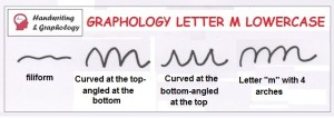
- Filiform: positive graphical environment: independence, evolution, intelligence, mental agility, ability, flexibility, spontaneous adaptation, ability to negotiate conflicts.
- Letter m in angle: Tenacity, good predisposition, tough character, little flexibility, hard to govern, irritable, impressionable. With graphism in curve: Even though is able to adjust easily, possesses enough energy to achieve goals.
- In arch: Little spontaneity, diplomacy, protects himself, covers himself, characteristic of lymphatic temper, it is the m of subalterns, docility and passive obedience, lack of initiative and autonomy. With firm pressure: tendency to submission, service personality. Hiding personality. Falseness.
- Curled arch: Selfishness. Kind due to interest.
- Disconnected: Personality breakup, difficulty for adjustment, insufficiencies. With a negative graphical environment, soft pressure, disorganization, from graphopathology, it may be interpreted as stress. This must always be confirmed with other signs. If the graphical environment is positive: Creativity, imagination. When only the first arch is disconnected: indecision, deep dissatisfaction.
- Letter m with 4 arches: Mental confusion. We need to confirm whether the pressure is low, the inclination is unequal or if we see torsions: anguish.
Graphology Letter “n” Lowercase
It is a true reflex of letter m. It is generally executed the same way. When they differ in the execution and letters “n” and “m” do not coincide, it is when letter n acquires importance, since it reflects the hidden tendencies of the individual.
This concludes the article about Handwriting Analysis: letter M.
Keep navigating this website!

Feel free to share it with your contacts if you found it useful. Keep reading this blog to learn more about Graphology letter P and How to become a graphologist. Follow us on Facebook!

I’m interested in learning free handwriting analysis online